The number one function of any website is to communicate knowledge and share information with its target audience. Put a little more simply, as web users, we wish to find answers to questions in order to make decisions... the quicker we find this information, the happier we usually are!
As a business with an online presence, providing the right information to customers quickly and efficiently, can instil greater confidence in your services and further your credibility.
One of the most effective ways to achieve this is through
great website design!
The web is made up of many media components, but can be simplified down to the basics; text, imagery and video for most websites, in fact 95% of information on the web is the form of the written text.
Typography plays a huge role in the design process of a website and done well, can make the act of reading and digesting information effortless for a user.
We layout a set of typographic rules very early on within our design process, making sure that all pages have a clear hierarchy of content from the very first heading (H1 HTML tag) through to the sign off / call to action at the end of the content.
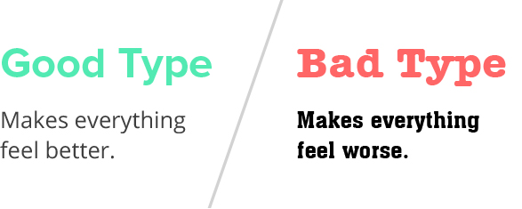
Font choice
Choosing the right font or combination of fonts can be a time consuming task, not only do they need to work well together, they also have to be legible in various sizes for the many devices the page will be displayed on. Brilliant use TypeKit, an online service that allow us access to thousands of licenced fonts, which substitute your computer or devices' default fonts.
Font size
As screen resolutions increase, so does the ability to use larger typography. A decade ago the standard size for body copy was 9-0 pixels but today we use double that and in some cases we go even larger depending on the content or design. If your website typography looks on the small side or is difficult to read then it's time for change and Brilliant can advise you on that.
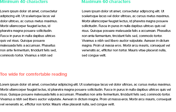
Paragraph length
One of the keys to good readability of text on a web page is the length of the paragraphs, we stick to around 60 characters. Typically we utilise a responsive framework called Bootstrap, which enables columns to 'stack' on tablet devices. Combined, we can be sure about the
website user experience overall.
Spacing
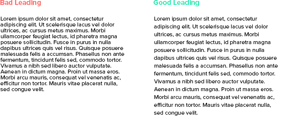
Allowing elements the right amount of space can drastically transform the mood of a website and a users ability to gather and digest information. It is important to not only give a paragraph the right amount of space around it but inside it too. For good readability, the leading (line height) of a paragraph should be 25-30% larger than the characters height.
Content growth
At Brilliant, we design all of our websites with the idea of expandable content in mind. We almost always design a website with some level of content to start with, but we know that websites are organic. As your business grows and changes, we consider this in the page design and allow a page to grow too, without compromising the layout or typography.
If you feel that your website is difficult to read or understand, or you are unsure about the quality of design and readability, then
contact Brilliant today. At Brilliant we will fully review your website and offer advice and support on visual best practices, how to improve your websites communications overall and give you better value on your website investment.


