

The truth is, bad design puts people off. It screams of unprofessionalism, and if your potential customers get a whiff of that, then it could be game over - they'll soon click elsewhere.

Things move fast in the design world and everything has a shelf life. For instance, with the dawn of Apple's iOS7 in mid 2014 went the disappearance of those outdated looking 3D (skeuomorphic) app icons, replaced instead by the flatter, far simpler style that is still popular today.
Now, some people might say they prefer the original icons, and that's fine of course. We're all different and we all dig different things. But those original designs are no longer cutting edge or even close. You want your business to be relevant, and you want to portray to your market that you're up to speed. It stands to reason that you don't want people thinking you've been left behind. Stuck in the Dark Ages. What you want is an exciting, clean user interface for your website.

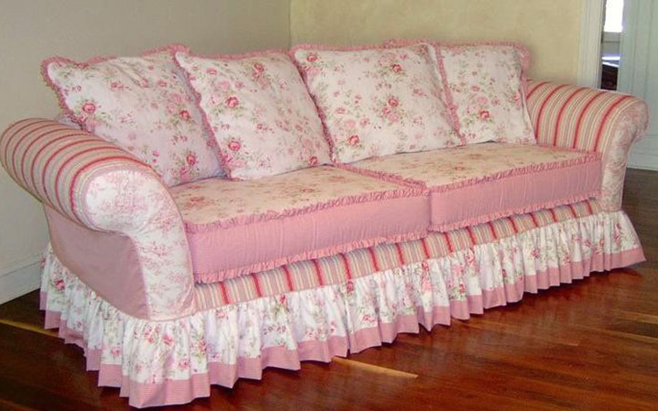
Of course, sometimes there's good reason to go retro. 'Vintage' is en-vogue right now, and IF it represents your brand then it can totally work. But it must be done properly, for there's a fine line between shabby-chic and simply shit. Rustic and just plain wrong. Cath Kidston and Kat from EastEnders... You get the idea.

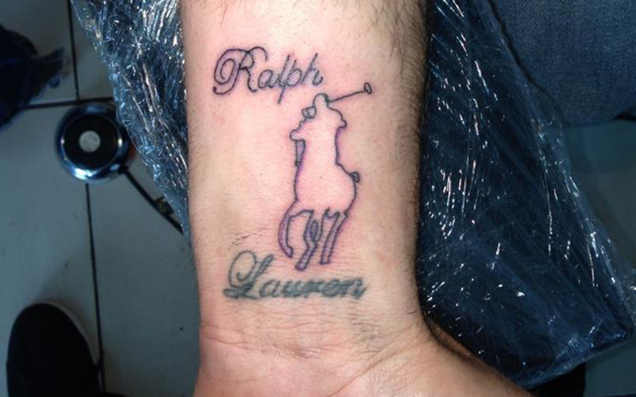
Design of course is subjective, but only up to a point. Even if you don't know your Comic Sans from your Cochin Bold, as a human being who walks around in the world being constantly exposed to visual information every second of the day, you have a finely tuned built-in radar (a crap-o-meter, let's call it) that will alert you to a poorly designed document/tattoo/website, should ye be so unfortunate to stumble across one. And let's face it, the chances of not doing so are slim.

Our crap-o-meter's can be great at picking up those dodgy design frequencies, but if we are ourselves somewhat 'creatively challenged' - or we can't even draw a straight line for love nor money - then we can't always see the wood for the trees when it comes to producing our own banners, logos or signage, etc.

Bottom line: Bad design is bad news for your business.
'But I don't have the budget to spend on a freshly designed website!' I hear you cry.
And my question in response to that would be: Can you afford not to update?
Here at Brilliant, we create for our clients clean, simple, sophisticated websites that whisper Quality, not shout Chaos. It doesn't matter if you run an antique online furniture store or you rebuild clapped-out racing cars, your site should still be a smooth, easily navigable experience for your visitors. It should entice and gently steer them towards a call-to-action; whether that's to make a purchase, or sign up to your mailing list so that they don't miss out on your cool news and offers, etc.
If it takes more than two clicks (to find what they're after) then it needs a fix. And we've got you covered there.
But ... even if you have a beautiful website sporting gorgeous photos and plenty of 'white space', allowing the page to breathe (just a fancy term for your screens looking uncluttered), it's all for nothing if those images are too big and take an age to load. And, if that's the case, what's worse is that Google will slap your search rankings down into the gutter like Hulk Hogan having a bad hair day. So we need to be on point when it comes to file sizes and all that stuff that runs in the background. The car might look cool, but it's a disaster under the bonnet.

Another consideration is the quality of your website's copy. You might be knocking it out of the park with your professional photography, but are you delivering the right message to your audience? This is important to get right.
Back to our book covers for a moment: you've picked up one from the shelf that has been designed by a professional cover designer. The image on the front suggests - no TELLS you - that this is the kind of novel you love to read. So you turn it over to check out the blurb on the back and ... BORING. The author's throwing names of characters at you one after the other, hinting at plot details here and there, but not giving you the emotional response that you're looking for in order for you to be willing to invest your time in reading this book.
So, you place it gently back on the shelf and move on without buying.
Everyone and their dog has a Facebook/Twitter/Pinterest/Instagram account these days. Everyone that is, except my mum. Probably. Social media is integral to your website, but only if you're active on there.
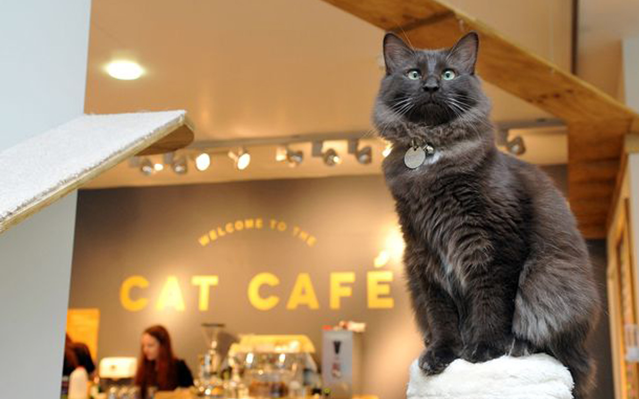
Now I'm not talking about posting cute kitten pics and photos of what we're all having for dinner - not unless you run a restaurant for cats. I mean that we gotta get down with the algorithms. That's not to suggest we should be sticking up meaningless drivel 17 times a day, but it should mean that we're sitting up, paying attention and putting out high quality content on a regular basis. Like this article you're reading now. (Well, if you've made it this far...)

I don't know about you but I'm amazed at the amount of times I've tried to email or just plain old-fashioned attempted to call a company, only to spend five minutes digging around on their website for an address or number. And it's usually the big playaz like The 'Zon (Amazon to us mere mortals) that like us to work hard for it. Well, we ain't them (yet) and we should be making it as easy as possible for our customers to reach out to us. Many hospitality companies now have a Live Chat option for their audience. Personally, I've found this to be a great way of getting in touch when I need a fast response and don't particularly want to pick up the phone.

In these mad times of fast-moving tech and ever-changing apps, it can be a juggling act just to stay afloat. We're always thinking about all the things we should be doing to keep our businesses ticking over and it can often feel like spinning plates whilst doing the Running Man dance. (Showing my age now.)
But it doesn't have to be a case of overwhelm. We're here to help, should you need us. Weirdly, we get a buzz out of sticking all this stuff together and handing you over a bells and whistles website that isn't difficult to maintain. Alternatively, we can keep hold of the reins for you so you can concentrate on doing what you do best: running your business.
Header illustration (Laptop image only): Abstract vector created by freepik - www.freepik.com

